
Black and white is not a filter

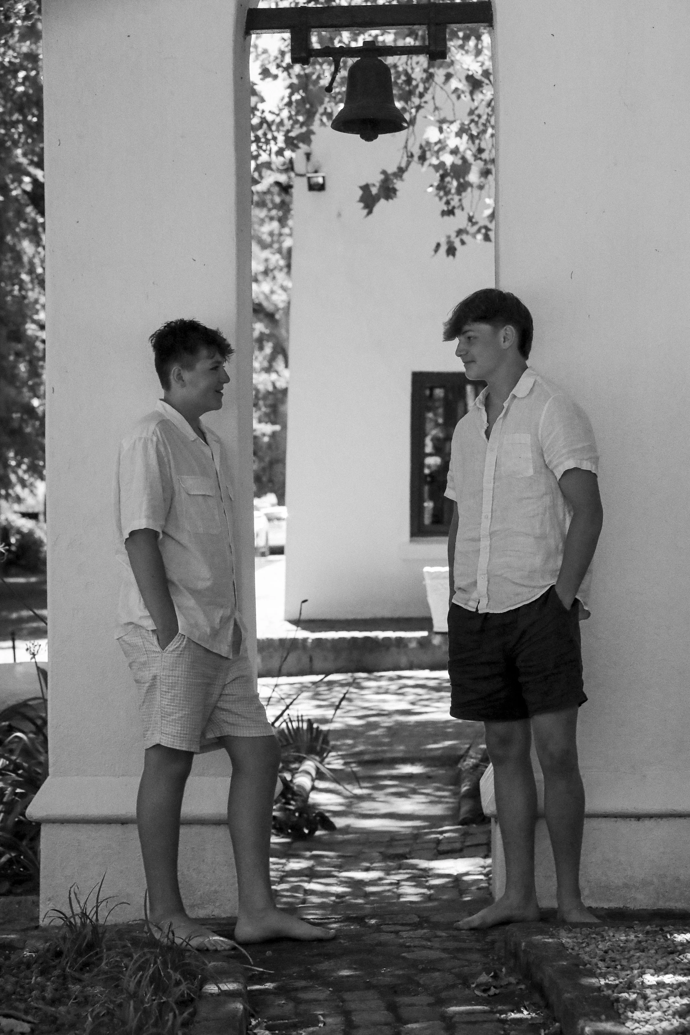


Black and white is never just black and white—and it is never just a filter. Working without colour is an intentional choice made at the point of seeing, shaping how an image is composed, exposed, and experienced.
This month we explored black and white across three contexts: fine art print, fine art for screen, and editorial work—each placing different demands on the image. Fine art photographs often reveal their full depth in print, where tonal range, texture, and shadow can be properly held. On screen, the same image can appear flatter or greyer, requiring stronger contrast and clearer structure to maintain its presence.
In print, the paper itself becomes part of the image. Surface, weight, and tone all influence how blacks settle and highlights lift. A photograph printed on soft cotton paper carries a very different feeling to one on a brighter, smoother stock. These decisions are not secondary—they are integral to how the work is read.
Editorial black and white brings another set of considerations. Images must communicate quickly and clearly, often reproduced at smaller sizes and alongside text. Structure, legibility, and restraint become essential.
Removing colour sharpens our awareness of these differences. Light becomes the primary language. Gesture, spacing, and timing carried more responsibility. The work asks for clarity of intent early, rather than reliance on adjustment later.
Across all formats, black and white reinforces a core principle of how I work: reduction is not simplification. It is precision. A deliberate choice about how an image is made, where it lives, and how it is meant to be seen.